

LIHEAP Platform Design
LIHEAP Platform for Business is a B2B2C service that aims to help people in crisis apply for Low Income Housing Energy Assistance Program (LIHEAP) funds and be able to pay their energy bills. LIHEAP platform can serve Entergy customers in LA, TX, MS, and AR.
Project Profile
-
Time 2020-Still in progress
-
Role UX Lead
-
Team 3 UX designer, 1 UX researcher, 3 developers, 1 product manager, 1 business Analyst
-
My main contributions
-
Build critical MVPs with product & tech
-
Develop UX involvement in product planning
-
Develop research/testing practice
-
Mentor designers and broaden team capabilities
Project Overview
Federal LIHEAP funds assist people with low income to be able to pay their energy bills. Entergy (a utility company that provides electricity for over 3 million people) researchers found out that more than 90% of their eligible customers in LA, TX, MS, and AR don't get funds from LIHEAP even though they received shut-off notifications on their energy bills! On the other hand, our researchers found out that in 2020, only the state of Louisiana held $11.83 million in unspent funds.
In this project, our objective is to maximize the allocation of federal LIHEAP funds to Entergy customers by wringing out all inefficiencies in the LIHEAP “market” through the implementation of innovative products and services.
Challenge
-
Applying to get federal LIHEAP funds is a highly complex, non-standard, manually intensive, low-tech set of activities filled with bottlenecks and defects.
-
Customers struggle to get assistance
-
Agencies are hindered by documentation requirements
-
LIHEAP agencies are requiring over the minimum federal requirements
-
All eligible customers may not be aware of LIHEAP
LIHEAP Platform Design Process

Discover
According to previous research from our colleagues, we knew 90% of eligible Entergy customers don't get assistance from LIHEAP. At this point, we needed to learn about:
-
Are Entergy customers aware of LIHEAP fund benefits?
-
What are the pain points during applying for LIHEAP benefits for our customers?
-
How do LIHEAP caseworkers work on each application and what are their challenges?
-
Gather customer and payment data for analysis
User Segment Analysis
-
We learned that we have 1.1 million customers with income less than 50k who are eligible to receive LIHEAP funds.

-
We discover that our potential LIHEAP recipients identify as one of the four personas we’ve classified:
-
Rural/Metro Mix & Settling Down
-
Bargain Hunters
-
Social Connectors & Starting out
-
Elderly
-
Focus Goroup Research (Interview)
User segment analysis did not only help us to understand user needs in different age groups but also helped us to recruit the correct participants for focus group research and user testing. To understand what are the pain points LIHEAP applicants go through when they want to apply for LIHEAP funds, we needed to conduct user interviews with participants from all 4 personas groups we've classified.
UX researcher and myself interviewed 20 Entergy customers who were eligible to apply for LIHEAP funds.


User Research Insights
As you can see below we learned that Enetrgy has an opportunity to improve the application process not even for Entergy customers but also for LIHEAP employees.

Define
After gathering data in the research phase, it was time to define who is our target and what is their journey. I used our findings to create 4 classified personas and a journey map to show our customers challenges during applying for LIHEAP funds.
Personas
According to what we found in the discovery phase, our potential LIHEAP recipients are classified into 4 personas:
-
Rural/Metro Mix & Settling Down
-
Bargain Hunters
-
Social Connectors & Starting out
-
Elderly
Empathy Map
Before working on a journey map, we need to put all we learned in an empathy map to be able to see what a customer does, says, thinks, and feels during their experience with LIHEAP. I hosted a workshop with our design team to dig into our data and what we've learned together and build a formative empathy map.

Customer Journey Map
Interviewing customers and also LIHEAP caseworkers showed us how complicated and connected these two journeys are! As a team, during sprint planning, we had a discussion with our product manager to understand how a journey map is going to help us to communicate better with Entergy leadership, Federal state leadership, and LIHEAP agencies managers. We, design team knew we also need a well-detailed journey map to be able to ideate around design solutions. With that said after listening to all team members I decided we need 3 journey maps:
1. A brief current applicant journey map - To help us communicate with leaderships at Entergy, federal states, and LIHEAP agencies, easier.
2. A brief current agency journey map - To help us communicate with leaderships at Entergy, federal states, and LIHEAP agencies, easier.
3. A detailed current applicant journey map + agency journey map - For designers and the rest of our team
4. A simulated applicant journey map + agency journey map - After the ideation session to show the solution

User Needs
After defining and sorting our information in the define phase, we realized there are 3 primary users' needs that we need to focus on when we want to ideate around solutions:
-
Entergy customers wish to apply for LIHEAP benefits online
-
Entergy customers like to be aware of documents are required for LIHEAP and be able to upload their documents vs mailing them
-
Entergy customers would like to be able to chat with LIHEAP caseworkers easily and receive status updates on their application online
Design
Let's the fun BEGINS!!!!!
Ideation
After researching user needs, we performed a more thorough competitive analysis to understand how others have met or missed those user needs.
By reviewing our research outcome We all agreed that the solution for this project is a digital platform and now we needed to ideate around what are the main sections we need to include in this digital platform. After having 4 hours fun and complex discussion we as a team decided this is our focus area for the platform:
-
Pre-eligibility - To show the chance of being eligible to get LIHEAP fund before spending time on document Preparation.
-
Document preparation - To show users what documents they can expect to have and how to have access to them before applying for LIHEAP
-
Applicant information - Biography, address, income, education information of the person who is applying
-
Household member(s) information - Biography, address, income, education information of household members of the person who is applying
-
Utility - Energy bills information
-
Review Application - Be able to review what they've shared before submission
-
Application Status - Be able to check their application status after submission with no need to call LIHEAP agencies


First Iteration - 2 Concepts
After the ideation session with whole team members in the project, with the design team, we ideated around ideal concepts for this platform. People who apply for LIHEAP funds are mostly anxious because of their financial pressure situation. It was really important to us to come up with concepts that are easy to follow, easy to understand, and efficient.
After our discussion we came up with 2 concepts:
Concept A - Step by step screens
To apply for LIHEAP funds, people need to answer 100 to 150 questions and it can be overwhelming and hard to focus on each question.
As we defined previously in the ideation workshop, this LIHEAP application portal would have 7 sections:
-
Pre-eligibility
-
Document preparation
-
Applicant information
-
Household member(s) information
-
Utility
-
Review application
-
Application status
Each section has its own questions. In concept A, each section's questions are categorized on separate pages and applicants can't see all questions at first unless they answer one question and then go to the next screen to see the next question.
Concept B - All in one
As we defined previously in the ideation workshop, this LIHEAP application portal would have 7 sections:
-
Pre-eligibility
-
Document preparation
-
Applicant information
-
Household member(s) information
-
Utility
-
Review application
-
Application status
In case B users are able to see all questions in each section on one screen.
A/B Testing
Now it was time to have an A/B testing session with 20 participants to find out which concept is a better choice for the LIHEAP platform. Moderating sessions got divided between myself and another designer. Our UX researcher joined sessions as a note-taker.
I chose our participants between people who are eligible for LIHEAP funds and who are going through that anxiety and pressure. It was really important to us to choose the right participants to have the best result.
A/B Testing Result
17/20 participants chose Concept B.
Concept A - Step by step
3/20 participants
Concept B - All in one
17/20 participants
" I prefer to scroll down and see all questions. I can more easily estimate that I want to complete that section now or at a better time."
- Ashley, New Orleans
What State first?
Now that we knew Concept B is what works the best, it was time to design wireframes for the whole LIHEAP application process. To start I had a meeting with the product manager to talk about the differences in the federal laws and policies in each state (LA, MS, AR, TX). LIHEAP is a federal service and for each step, we need to be in touch with each state's federal leadership to make sure we are on the right path. With that said, it was wiser to only focus on one state, go forward until the project has a successful pilot, and then expand the project to other states. According to our relationships and the product manager's decision, we decided to go forward with Arkansas.
As a product design leader on this project, I made sure to that all other 3 designers are aware of the decision and Arkansas LIHEAP application process was going to be used for designing wireframes.
User Flow
As we defined previously in the ideation workshop, this LIHEAP application portal would have 7 sections:
-
Pre-eligibility
-
Document preparation
-
Applicant information
-
Household member(s) information
-
Utility
-
Review application
-
Application status
User flow helps to understand, how all these sections are connected with each other, and also user flow is a great way to communicate design through the process with the engineering team and product manager.

Second Iteration - Wireframes
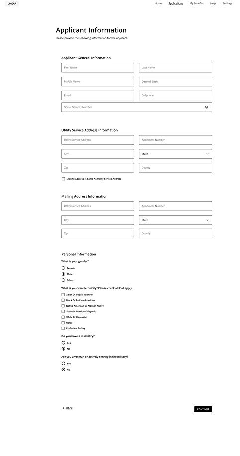
After having the user flow, now it was time to design wireframes based on the 7 sections for Arkansas in Desktop and Mobile sizes.
-
Pre-eligibility


-
Document preparation

-
Applicant Information
-
Applicant general information
-

-
Applicant Information
-
Applicant employment information
-


-
Applicant Information
-
Applicant financial resources
-


-
Household Member(s) Information
This section screens are similar to applicant information and it includes:
-
General information
-
Employment information
-
Financial resources
I don't add their screens here because of the high volume of this page
-
Utility Information


-
Review Application


-
Application Status


User Testing
It took 3 months to design wireframes for Arkansas. Every week we had meetings with Arkansas LIHHEAP agencies leadership to show the work process and make sure what we ask applicants on our wireframes is accurate and also enough for LIHEAP caseworkers to go forward with applications. After having a thumbs up from Arkansas leadership, it was time to conduct user testing with eligible LIHEAP applicants to give them tasks and observe how to do them.
I conduct a user testing session, in-person in Arkansas CSO agency with our product manager assistance. We had 16 user testing sessions with 16 participants in age range of 25 to 55 years old. You can see the result in the following:
-
Pre-eligibility screen feedback

15/16 participants don't care about pre-eligibility results, because it's a guess and tey prefer to apply for LIHEAP funds even if the pre-eligibility says they might not be eligible to get the fund.
So pre-eligibility got removed!
-
Document preparation screens' feedback

16/16 participants find it useful.
So we kept it this way!
-
Applicant information + Utility screens' feedback
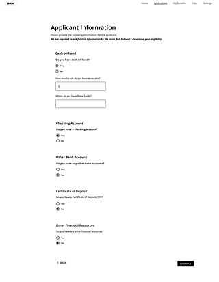

11/16 participants like to know how many steps they have to take to submit the applicatin.
9/16 participants want to go back to some specific sections to check what they submitted.
So we added a train tracker to screens


-
Application Status

15/16 participants want to see the dates for any status updates.
16/16 participants were confused about how they get back to the application to edit it.
So we added dates and also an application edit option.
Adding date to any status update
Another access to "edit application"

Design system
We needed a well-detailed design system to go forward with this project. I took a course in NN/G to learn more about how to design a practical design system and led the design team to work on it together. after talking with engineering, we decided to go forward with the Material Design UI kit and build our design system based on that. You can see some examples below:


Design system component examples- LIHEAP platform
Develop
Now that we had participants feedback and all wireframes revised according to what we learned in user testing session, we were ready to work on high-fiedility wireframes. In this this step we collaborated so closely with engineers to make sure we are on the same page with design and coding side of LIHEAP portal.
High fidelity wireframes - Prototype
We had revised low-fi wireframes and also we had our components ready in the design system. Now it was time to design high-fidelity wireframes and collaborate with engineers as closely as possible!
In te following you can see the prototype on Desktop and Mobile in 2 sections:
- Apply for a LIHEAP fund
- Check the status
-
Apply for a LIHEAP fund - Desktop
-
Apply for a LIHEAP fund - Mobile
-
Check the status - Desktop
-
Check the status - Mobile
Pilot Result (Arkansas)
For 3 weeks, in February 2021, we collaborated with a LIHEAP agency in Arkansas to assist eligible applicants with our LIHEAP platform. 140 people applied with our LIHEP platform and the outcome of this experience what outstanding:


What's Next?
After having a huge success in the pilot, this project is going to expand to cover Louisiana, Texas, Mississippi, and of course Arkansas. There are federal policies differences between these 4 states when it comes to LIHEAP funds. Before starting any design changes, we are going to have a meeting with Federals state leadership to see if they all can come along and we only design one platform, the same policies for all states!
It is a work in progress!