
Repay By Paycheck (RBP)
Repay By Paycheck (RBP) is a Brigit app feature that enables users to access instant cash advances and repay them directly through their paycheck. By securely linking their payroll provider, users can opt into automatic paycheck deductions, ensuring seamless and timely repayment. RBP offers a predictable, low-friction alternative to traditional repayment methods, helping users manage their finances with confidence.
Project Profile
-
Company Brigit
-
Timeline JUL 2025- NOV 2025
-
Team Solo designer - 1 COO - 8 engineers, 2 Engineer managers
-
Tools Figma, Figma Make, Dovetail, Figjam, Jira, Userbrain
-
Process
Requirements, Research, Design, Develop -
Target users
Brigit users who are not eligible to take Instant Cash
💡 Note: This case study focuses exclusively on the enrollment flow within the broader Repay By Paycheck (RBP) experience. The full scope also included post-enrollment, disbursal, unenrollment, and complex error handling, which are not shown here to keep the narrative focused and digestible.
Problem Statement
Brigit users repay advances when their paycheck is deposited into their bank account, competing with other financial obligations and outgoing payments. This approach can lead to higher delinquency rates, limiting our ability to approve advances for more users or offer higher credit limits.
Solution Statement
IF we introduce a repayment option directly from users' payroll deposits
BY enabling users to allocate a portion of their paycheck before it reaches their bank account
WILL see reduced delinquency rates, increased credit limit utilization, and higher user retention
BECAUSE this repayment method eliminates competition with other outgoing payments, encourages responsible borrowing, and builds trust by offering higher credit limits and more accessible financial solutions.
Understanding the problem
Methods:
1) Design Brief: We began by aligning with COO, engineer managers, data science, and risk teams to define success metrics, business constraints, and user goals for Brigit’s repay by paycheck experience.
2) Competitive Analysis: I conducted an audit of direct deposit and paycheck repayment flows from key players in fintech and payroll, identifying patterns in opt-in language, approval messaging, and paycheck deduction transparency.
3) User Interviews: I ran unmoderated usability tests and 1:1 user interviews with both approved and unapproved Brigit members. This allowed us to assess comprehension of the concept, test clarity of content, and probe deeper into trust concerns, user control, and income variability.
Key Findings:
1) Lack of Resource: Many users feared loss of control or unexpected deductions. They needed clearer explanation of how much would be deducted, when, and under what circumstances.
2) Need for Assurance & Transparency: Users wanted upfront visibility into repayment logic and eligibility, with clear reasons why they were (or weren’t) approved, and reassurances that they could opt out or adjust at any time.
3) Job & Pay Variability: Many Brigit users had multiple jobs, irregular income, or frequently changed employers. This made it hard to align paycheck-based features with traditional assumptions around biweekly pay or employer stability.
Ideation Solutions
Goals:
1) Clearly communicate how paycheck-based repayment works before users begin setup, ensuring transparency and trust from the start.
2) Simplify the core steps—connecting payroll, verifying identity, and setting up direct deposit—into a guided, digestible experience.
3) Design with third-party constraints in mind, accounting for limitations from partners like Argyle and Cross River Bank to prevent user friction and edge-case failures.

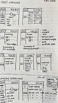
Sketching allowed us to explore different ideas & layouts

Diagram allowed us to map and understand userflow

Low fidelity wireframes allowed us to curate our ideas & review them
Designing the Final Solution
Winning Ideas:
1) Focus on the $100 cash advance qualification.
2) Provide clear, complete information so users know exactly what’s required and why.
3) Clearly spell out all review steps after payroll and direct deposit are linked.


Step 1: Having enough information in the primer screen


Step 3: User be able to verify their identity


Step 2: User be able to connect their payroll


Step 4: User be able to set up their Direct deposit to repay Brigit with their paychecks.
User Feedback
Think-Aloud
I conducted user testing sessions with 12 participants, guiding them through the designs and encouraging them to think aloud. This approach enabled us to evaluate our solution with real users who interact with our product daily.
Key-Findings
1) Information overload on entry: The initial primer screen presented too much information at once, causing users to feel overwhelmed. Most ignored the FAQ section and fixated on figuring out how to enroll and become eligible. They craved a simplified, step-by-step overview rather than dense educational content up front.
2)Lack of progress visibility: Users had difficulty understanding where they were in the enrollment flow. The three main steps—connecting payroll, verifying identity, and setting up direct deposit—were not clearly sequenced or visually marked. As a result, users didn’t know which step they were currently on, what they'd already completed, or how many steps were left to finish enrollment.
The Prototype I built to present my design to users for usertesting.

Design Iteration
Changes I made
1) Primer screen redesign: Simplified the screen by removing overwhelming FAQ content, clarified the three-step enrollment process by adding “Verify your identity” as its own step, and rewrote copy to be more benefit-driven and user-friendly. This helped users quickly understand what to do, why it matters, and how to move forward.
2) Structured step-by-step redesign: Replaced flat, disconnected screens with a guided three-step flow that clearly communicates progress and sets expectations. Added visual progress indicators, introduced step-specific illustrations, and reworded copy to be more supportive and transparent—helping users feel more confident as they move through enrollment.


New design for a better structured step-by-step process
New primer screen design
Results
What we built:
1) A primer screen with a clear content about RBP feature
2) Allowing user connect their payroll
3) Allowing user verify their identity
4) Allowing user connect their direct deposit to Brigit
Note: This case study focuses exclusively on the enrollment flow within the broader Repay by Paycheck (RBP) experience. The full scope also included post-enrollment, disbursal, unenrollment, and complex error handling, which are not shown here to keep the narrative focused and digestible.
Primer screen + payroll connection


Verify identity


Set up direct deposit


Conclusion
Challenges
1) Complex edge cases: Designing for enrollment was especially challenging due to a wide range of edge cases stemming from outdated underwriting logic, variations in employment types, and third-party constraints like payroll providers and bank policies. Each user scenario introduced new logic paths we had to account for.
2) Compliance & policy limitations: Collaborating with legal and compliance teams revealed how nuanced our messaging needed to be. There were strict guidelines around what we could and couldn’t say—leading to rounds of iteration just to find language that was both compliant and clear to users.
Key-Takeaways
1) Designing within real-world constraints: his project reinforced the importance of deeply understanding backend systems, third-party dependencies, and compliance rules. User experience isn’t shaped by interface design alone—it’s shaped by what’s technically, legally, and operationally possible.
2) The power of micro-iteration: Between edge cases, stakeholder feedback, and legal reviews, even minor pieces of UI (like error states or step labels) went through multiple rounds of refinement. Staying nimble and testing copy or interaction changes quickly helped us move forward without getting blocked.